Bad Photos of Irish Properties For Sale

Updated 11th March, 2015


Daft.ie is Ireland’s biggest property site and it’s a valuable resource for anyone thinking of buying or renting property. You can browse through images of houses, apartments and commercial premises from all around the country, images that have been uploaded by auctioneers and estate agents.

I would love to say that the photographs have all been well-taken – properly lit, in focus and well composed – but, alas, that is not so in a frighteningly large number of cases (if a quick browse through a random sample of properties is anything to go by).

Which prompts the question: why, if you are an auctioneer/estate agent, do you not ensure that properties are presented in the best possible way so as to entice prospective buyers/renters?

It is not good enough to use a 10-year-old compact camera to fire off a few out-of-focus shots and hope for the best. Get a proper photographer to do the premises justice. He/she will know how to expose properly for even the darkest of rooms, will be able to use artificial lighting to best effect, and will compose both interior and exterior shots so that the final images will enhance and flatter. Of course, many acutioneers/estate agents do just that, as their photographs show. But as for others ….


BadPropPhotoKillarney2

It’s a no-no to have people in property photos (unless they are being sold with the house – the listing in this instance made no mention of it).

BadPropPhotoKillarney

The unmade bed look is not a good look (unless you are Tracy Emin and are pitching this for inclusion in the Tate Modern collection.)

BadPropPhotoKilcummin

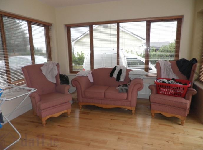
How difficult would it have been to (a) move the vehicles out of view and (b) get rid of the clutter on the chairs?

BadPropPhotoGneevguilla2

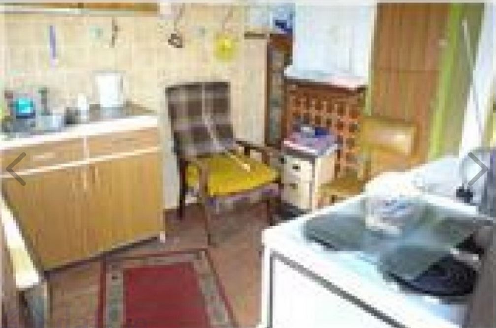
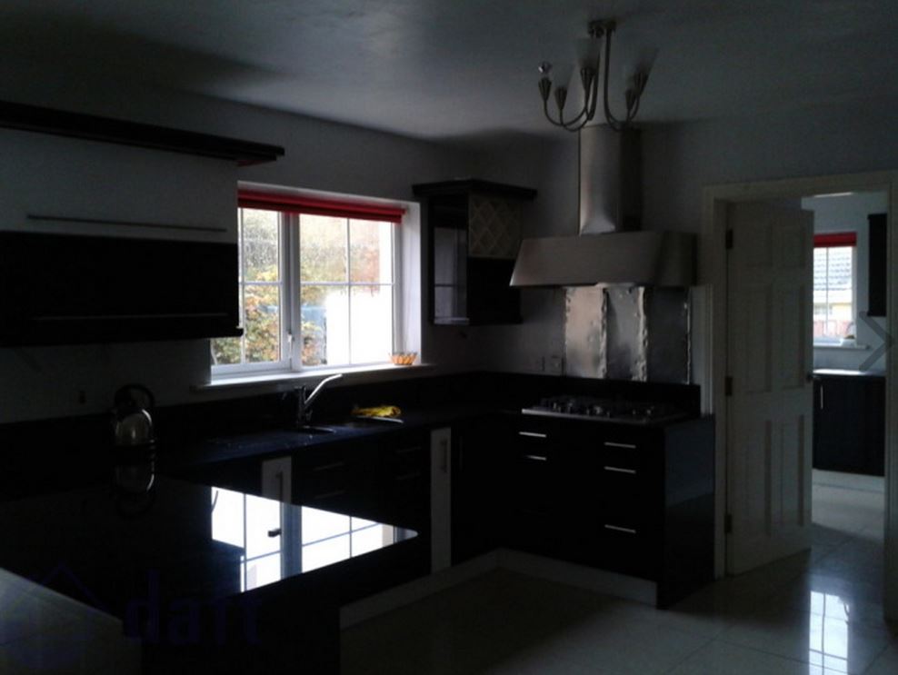
Not the most attractive of kitchens even without the clutter but why photograph it in this condition?

BadPropPhotoGneevguilla

Bad lighting, bad angle …. bad EVERYTHING.

BadPropPhotoCurrowKillarney

Another pesky reflection-in-the-mirror situation.

BadPropPhoto10AnCorranCulArd

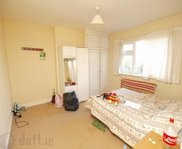
Ever wake up in the morning with the feeling that you’ve been riding all night? (Not a bad photo – just bad taste on the part of the occupier.)

BadPropPhoto2DaffFieldsBcollig

Unless the doggie is going with the property he/she should have been omitted.

BadPropertyPhotoMar7

Another wonky angle,  camera shake, reflection in the mirror classic.

BadPropertyPhoto9

Because one thing prospective purchasers want to see is the contents of the current owner’s fridge.

Mayo Impressionist

From County Mayo, another property photographer going for the impressionist look. Very artistic.

Mayo 2

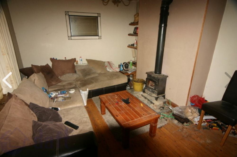
It would have taken only two minutes to tidy the room and get rid of the clutter.

Cork2

Yet more clutter. Why photograph the room in this state?

Cork1

How untidy can you get?

BadPropertyPhoto11

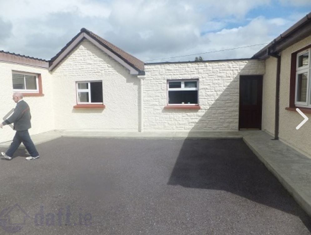
Property photography 101 – keep humans out of the pictures!

BadPropertyPhoto10

Yet another stray dude.

BadPropertyPhoto1

And another one.

BadPropertyPhoto12

Is it a ghost?

BadPropertyPhoto8

Check out the figure on the wall. Creepy!

BadPropertyPhoto14

I can’t blame the photographer for not tidying this up. There’s a limit to what he/she can be expected to do.

BadPropertyPhoto4

I have no idea what this is supposed to be.

BadPropertyPhoto7

The conservatory with rubbish bags is not a good look.

BadPropertyPhoto13

Another photographer who went for the impressionist look. It references Van Gogh’s “Chair” nicely, don’t you think?

BadPropertyPhoto2

Darn mirrors. If only there was a way to shoot an interior without getting your (and the occupant’s) reflection in the photo. (Hint: hire a proper photographer.)

Image

Badly lit and taken at a resolution totally unsuitable for uploading at this size. It may have looked OK (ish) on that cheap 2MP compact you bought 15 years ago but really, what *were* you thinking when you published this?

Image

Nice white van. I presume though that you meant to show the room?

Image

Aimed at buyers with chronic myopia, perhaps? It will look just like this in reality to them.

Image

Ugh. Another tiny resolution image enlarged far beyond its limits. And having a vehicle in the drive is a big no-no –  people are interested in buying the house, not the car.

Image

This might be a winner in a photo competition for dark, moody interiors. As a photo designed to sell a house it’s crap.

Image

Oh dear. This will never feature in The House Beautiful magazine. If the owner/renter couldn’t be arsed to tidy the place up before you arrived get him/her to do it before you take a photo. Or, tidy the damn place yourself. Don’t show this kind of thing to the nation.

Image

Did you even stop to think that maybe, just maybe, the inclusion of the ironing board might not have been the best compositional idea? Re-positioning the stools should also have been a no-brainer. Pity too about the dark spot in the foreground which the built-in flash couldn’t illuminate.

PropPic26

The unmade-bed-and-untidy-room is not a good look.

PropPic25

The occupiers clearly didn’t give a damn about how the place looked. Your job is to make it look somehow half-decent for the camera.

PropPic27

Did you not have your rubber gloves with you to pick up the dirty towel? An essential item in any property photographer’s arsenal. There’s a lot more wrong with this shot but the towel grabs our attention.  

PropPic8

Ireland’s answer to the Leaning Tower of Pisa?

Image

Poorly lit and the toilet seats in property photos should *never* be up.

Image

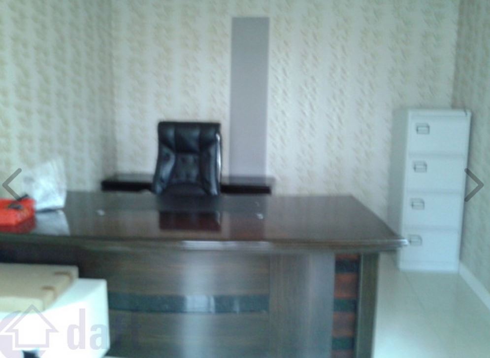
Another out-of-focus disaster.

Image

This property should be of interest to those keen to investigate psychic phenomena – that bright spot on the lower right may be evidence of an apparition.

Image

Ah, look – Compo and Nora Batty on the telly! Tip: switch off TVs when photographing rooms.

Image

Cast A Giant Shadow was a good 1966 film starring Kirk Douglas and Senta Berger. This is a bad photograph.

PropPic24

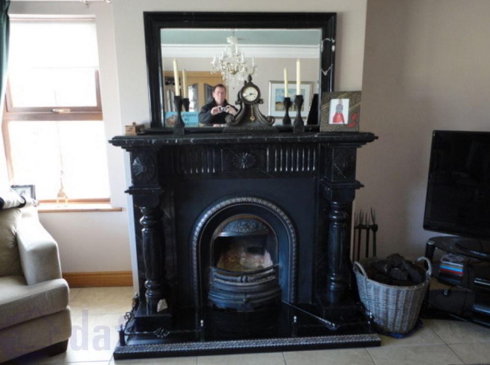
Not a bad self-portrait, dude. What’s it doing on a property website?

Image

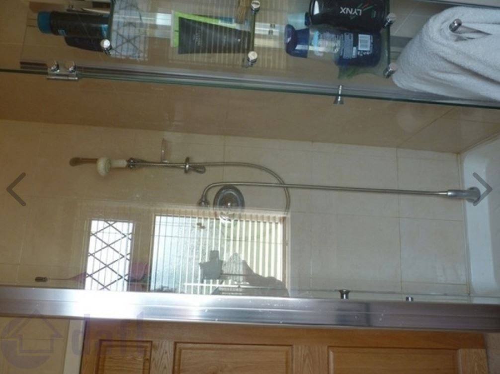
Shower units are usually presented in the vertical position.  And is that a reflection of your hand holding the camera?

Image

This might have been a contender were it not for the lack of sharp focus, the uneven lighting and the blue car outside the window.

Image

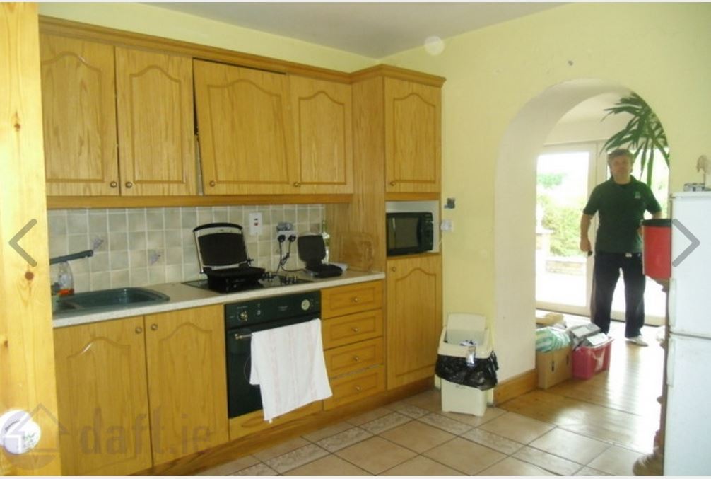
Another photographer-in-the-picture situation.

PropPic23

From the  black-hole-of-Calcutta school of property photography. Ain’t never going to be a success.

PropPic22

I presume you inadvertently clicked the shutter while looking at something else.  There can be not other explanation. But why post it?

PropPic18

Too many toilet rolls.

PropPic20

Would it have killed you to remove the clothes from the banisters before taking the photo?

PropPic21

Not a great photo but it would have been significantly improved had you removed the bucket and brush.

Sadly, these kind of photos are not uncommon on property websites. Apparently there’s a lot worse out there. A Twitter contact of mine says he saw a photo of a room with a guy sitting watching telly!  I would love to see such examples so if you come across any please drop me a line: carrigman@gmail.com.

Is It A Bird? Is It A ..?

Visitors emerging on to the N27 from Cork Airport must be puzzled by an odd-looking shrub in the centre of the roundabout.

Airport-Sculpture-4

What is it meant to be, exactly?

Form one angle it looks like some lumbering dinosaur. But why? Is Cork such a centre of paleontology that a dinosaur needs to be represented at one of the major visitor entrances to the city? And why at the airport?

Airport-Sculpture-1

From another angle it looks more like a large tortoise. Again, the connection with the city is not obvious. Perhaps it’s meant to say something about the slow pace of life in the city?

Airport-Sculpture-3

If you look closely at the “head”, you will be able to see a remnant of a strip of fake windows.

I’m sure it even has many locals confused as well, especially those that are too young to remember that it was, once, a representation of … an aircraft. A rather fat and not very airworthy-looking aircraft, granted, but a recognisable flying-machine nonetheless. It even had rows of fake windows down each side.

Airport-Sculpture-5

Sadly it has fallen into neglect and it no longer looks like anything. Now it’s just an overgrown, unkempt bush that is crying out for the loving attention of a good topiarist to restore it to its former glory. Failing that, the best thing the authorities could do is cut it down and save us all the embarrassment of having to explain to bemused visitors what it is supposed to be.

Obtaining my ARPS

In March 2012 I achieved my Licentiateship of the Royal Photographic Society, the LRPS.

The next distinction to be aimed for was the Associateship which, according to the RPS, requires “images of exceptional standard and a written Statement of Intent (what you hoped to achieve with the work). This is a significant step up from the LRPS. At this stage a creative ability and a personal style (what makes your work unique to you), along with complete control of the technical aspects of photography must be evident.”

The problem I faced was fixing on a subject. I do mostly landscape photography and seascapes feature a lot given my proximity to the coastline of East Cork. I considered a panel of seascapes but I wasn’t confident that I could bring a personal style to bear. Long exposures taken by the coast is a technique that I like but it can hardly be described as a personal style. I’m sure the RPS judges have seen it done far better. I needed something a bit different. But what?

Then, one afternoon last November, I was walking by the River Lee in Cork City. There was a high tide and the reflections from North Mall looked beautiful in the calm waters of the river. I had my little pocket camera with me – a Sony RX100 – and I took some pictures.

When I processed them I decided to invert the images so that they appeared the wrong way up as if you were looking at the buildings straight on rather than at reflections. They looked more like paintings than photographs. I realised then that I had an Associateship subject. I booked my place for the Distinctions sittings in Birmingham in March.

Throughout November and December and part of January I made numerous visits to the city to photograph reflections, timing my trips to coincide with the high tides. I took hundreds of exposures. I used the Sony RX100 throughout – it was far less conspicuous than one of my Canon DSLRs and was thus ideal when traversing the city. Besides, I knew its capabilities and I was confident that I could produce 15×10 prints from it without compromising on quality.

I whittled down the images to about sixty from which I would make a panel. I made individual 6×4 prints and began the hard work of deciding on the final fifteen.

This is a tortuous process. It’s not a matter of just producing fifteen good prints – they must work together as a panel which must have a logic and a coherence and which must reflect the Statement of Intent. I began by laying out fifteen prospective photos in three panels of five (I had opted for the five/five/five layout). This became a daily ritual for weeks – shuffling the 6x4s, removing some, adding others. Each time I had what I thought was a finished panel I would return to it the next day and re-arrange it once again. Eventually I arrived at a final decision – I had a panel that I was satisfied with.

I began printing 15x10s on Ilford Galerie Smooth Pearl paper (now discontinued) on my Epson R3000. Some prints worked first time out of the printer, others required two or more attempts before I was satisfied. This is where home-printing has a huge advantage over labs: you can keep at it until you get the results you require. I dry-mounted them on adhesive backing board and placed them in white A3 mounts.

This process was completed two weeks before the distinctions sitting date, March 3rd. In the meantime I was wracked with doubt. Was I kidding myself? Was the panel up to standard? Would the prints be eviscerated by the judges on the day? Why did I subject myself to this ordeal?

The day of decision started out well. I was on the 6:45am flight out of Cork to Birmingham, the panel in a secure and well-padded case in the hold. The flight was due to land at 8am. Shortly after the pilot began the descent however he began to fly in a holding pattern. The airport was shrouded in fog and no flights were landing. He would circle and wait for it to lift. This continued for about fifteen minutes whereupon he announced that he was diverting to Manchester as there was no sign of the fog disappearing. This was a bad omen for the rest of the day. Would I be able to get to the RPS venue at all?

When we landed in Manchester about twenty minutes later I phoned the RPS HQ and told them what happened and asked them to advise their representative in Birmingham that I hoped to get there sometime later in the morning.

I arrived at 11:50am following a two-hour coach trip from Manchester. Was I too late? Would I have to re-schedule the application to another sitting? I needn’t have worried. I was assured that they would be able to fit in my panel before lunch. After grabbing a much-needed coffee I returned to the auditorium to await my fate.

There were two panels judged before mine. There was an excellent black and white one which I came in on at the very end and which the judges praised highly. The next was a series of colour still-lifes of food which was technically very accomplished. However, the Statement of Intent by the photographer did not match the photographs and this was probably the main reason for the panel failing. (The judges had some compositional criticisms as well.) It cannot be emphasised enough: the Statement of Intent is crucial.

Next up was my panel.

Image

I was glad at least to see the prints were placed exactly as I had indicated in my hanging plan. One of the judges read out my Statement of Intent:

I want to show in these inverted reflections how a river is like a multi-faceted artist, by turns – realist, impressionist, and modernist, taking the mundane aspects of the city, its buildings, trees and bridges, and transforming them into a variety of shimmering, evanescent images.

It is not a pleasant experience to sit there while the judges are reviewing your work. They sit and consider the panel first from a distance of a few feet. Then they stand and review the prints close-up, taking down some of them from the stand the better to examine them in detail. They were discussing them among themselves for awhile – to me it seemed like an age – and then they sat down. This was it: the verdict. Oh God, please let this torture be over soon.

The chairperson of the judges asked one of them to comment. He stood and faced the audience. “I think this is a stunning panel” he said. He found the concept of inverted images “very clever” and had not seen it before. I could hardly believe my ears. Another judge commented on how her favourite print looked like a water-colour painting. Yet another told the audience that the prints contained a wealth of detail that would not be apparent from where they were sitting. The chairperson asked the judges to vote and then announced that I was to be recommended for the Associateship (which was formally ratified by the RPS Council on 13th March).  I stood to acknowlege the applause. It was an incredible feeling – a mixture of overwhelming relief and joy. I hardly needed an aircraft to return to Cork later that day – I think I could easily have floated home.

Image

Image

Image

Image

Image

Image

Image

Image

Image

Image

Image

Image

Image

Image

Image